The idea of traveling the world appeals to the vast majority of us but, for those of us lucky enough to block off the time and money necessary to roam, one very important question remains: where exactly should I go? The Earth is a big place with many alluring destinations, each of them competing healthily for your travel dollars.
One of the weapons used in the modern global community’s battle over attracting tourists is the simple infographic, a visualized piece of media and information aimed at piquing your interest enough to get you on a plane and into a local hotel as soon as possible.
If you’re thinking of traveling and need something to help push your decision of locale over the edge or you’re simply a geography buff who enjoys what each corner of the world has to offer, you’ll love these interesting travel infographics.

For the bicycling enthusiast comes this poster, created to lure travelers to Amsterdam for what is probably not the first of the country’s draws to come to mind. Based on data gathered for what went on to become the winning entry in the Copenhagenize list of the best urban cycling locations in Europe, this infographic offers tidbits about the number of bikes on the roads and paths in the Netherlands, the number of them that are stolen and recovered, and some of the beautiful spots one can visit using nothing more than two wheels.
One of the most important things to consider when you’re thinking about taking a faraway vacation are hotel costs and Hotels.com does a great job with their annual infographic outlining both current hotel prices and changes, whether higher or lower,around the world and across the United States in particular. If cash-flow is an issue, considering visiting Portugal instead of Switzerland!

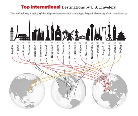
Social media trend analytics group MashWork released this infographic towards the end of the 2011 holiday season outlining in great detail the methods of travel, final destination and booked accommodations of people planning to travel, all by analyzing more than 20,000 Twitter status posts through November and December of last year.
The cool array of data gives you the ability to rate airlines, train service providers and car rental agencies by their general usage numbers, determine the most sought-after holiday destinations and book the hotels most often on the mind of would-be travelers looking to visit areas of the continental United States.

For travelers with goals more official than grandma’s home cooking comes this infographic from Credit Donkey aimed at American travelers headed to both domestic and foreign destinations. With data presented on everything from the average business traveler’s profile to the most-used airports along with tips on how to spend and save that limited business travel expense account, this single infographic has lots to offer American travelers when they head out on business.

In our ever-connected world, traveling can be done vicariously in more ways than one, making infographics like this one an interesting read whether you plan to visit the United Kingdom or not. Created by a British tourism agency and focused in great part on the exploits of adventurer and explorer Thomas Cook more than 170 years ago, this graphic leads you through a brief history of holidaymaking in Britain over the past two centuries.
From the advent of inexpensive rail lines and the motor car itself to the number of visits made outside the country by U.K. travelers in 2011 (a whopping 55 million!), the tidbits to be gleaned here are interesting under any circumstances.
Conclusion
Infographics, no matter how much detail is crammed into them, shouldn’t be your sole source of information about travel methods or destinations but they can most definitely serve as eye-catching sources of inspiration and basic details when you’re planning a trip; in a world filled with exciting travel opportunities with businesses all competing for your tourist dollars, you’ll need all of the help you can get in narrowing down your list of hotspots!
Annie blogs on traveling and adventure for GrandCanyonTourist.com – check out our site for the great selection of adventure and sightseeing coupons including Maverick Helicopters, Grand Canyon Helicopter Tours, etc.
local search engine optimization local search marketing services


 Google announced a new layer of data being added to Google Maps for public alerts. If there are emergency alerts in your area, Google will show them to you on the map, with more details on the alert.

